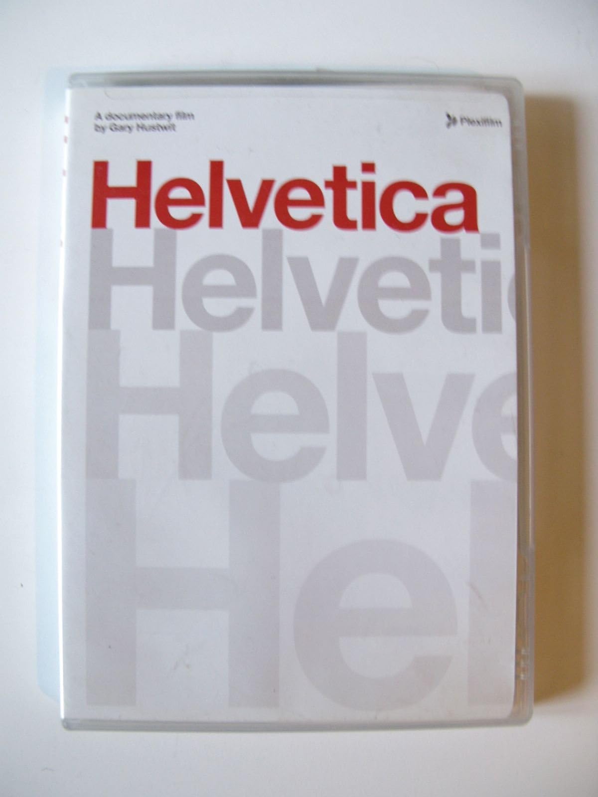


Helvetica
Product ID: 1458869
Details
- ColorColor
- FormatDolby Multiple
- LanguageEnglish
- Runtime1 hour and 20
Buy anything from 5,000+ international stores. One checkout price. No surprise fees. Join 2M+ shoppers on Desertcart.
Desertcart purchases this item on your behalf and handles shipping, customs, and support to Brazil.
Blissful..it sharpens your eye...and makes connections between art and life. -- Chicago Tribune Helvetica is truly a work of art. -- Austin Chronicle One of the wittiest, most diligently researched, slyly untelligent and quietly captivating documentaries of the year. -- Time Out London Provocative. -- NY Times Viewers are in for an exclamation point of joy from such a well designed doc. "A -" -- Entertainment Weekly Changing the world, one letter at a time… Helvetica is a feature-length independent film about typography, graphic design and global visual culture. It looks at the proliferation of one typeface (which will celebrate its 50th birthday in 2007) as part of a larger conversation about the way type affects our lives. The film is an exploration of urban spaces in major cities and the type that inhabits them, and a fluid discussion with renowned designers about their work, the creative process, and the choices and aesthetics behind their use of type. Helvetica encompasses the worlds of design, advertising, psychology, and communication, and invites us to take a second look at the thousands of words we see every day. Interviewees in Helvetica include some of the most illustrious and innovative names in the design world, including Erik Spiekermann, Matthew Carter, Massimo Vignelli, Wim Crouwel, Hermann Zapf, Neville Brody, Stefan Sagmeister, Michael Bierut, David Carson, Paula Scher, Jonathan Hoefler, Tobias Frere-Jones, Experimental Jetset, Michael C. Place, Norm, Alfred Hoffmann, Mike Parker, Bruno Steinert, Otmar Hoefer, Leslie Savan, Rick Poynor, Lars Muller, and many more Special Features 95 minutes of bonus interviews English and German subtitles Review: Why not Helvetica? - Weather you use the font or not, love the font or hate it, you will learn to appreciate modern typography more by watching "Helvetica". I thoroughly enjoyed the documentary and shared it with my graphic design students, many of whom bought their own copies. Typographic liberties taken in the film do not lessen the impact of a funny, quirky, fast paced look at the major tool of graphic designers-type. Great way to introduce students to contemporary designers and their thoughts about typography. Can't wait for Objectified!!! Review: Love Helvetica, Hate Helvetica...See Helvetica - The historical significance of the typeface as well as the on-going evolution of typography make this a must see for anyone interested in typography and graphic design, but also a fine entertainment for film enthusiasts. Compelling interviews with notable professionals are informative, witty and often hilarious. Visuals run the gamut from elegance to true grit. Kudos to Gary Hustwit and his crew for this living history before it is not longer possible.
| Contributor | Alfred Hoffmann, Bruno Steinert, David Carson, Erik Spiekermann, Experimental Jetset, Gary Hustwit, Hermann Zapf, Jonathan Hoefler, Lars Mller, Leslie Savan, Massimo Vignelli, Matthew Carter, Michael Bierut, Michael C. Place, Mike Parker, Neville Brody, Norm, Otmar Hoefer, Paula Scher, Rick Poynor, Stefan Sagmeister, Tobias Frere-Jones, Wim Crouwel Contributor Alfred Hoffmann, Bruno Steinert, David Carson, Erik Spiekermann, Experimental Jetset, Gary Hustwit, Hermann Zapf, Jonathan Hoefler, Lars Mller, Leslie Savan, Massimo Vignelli, Matthew Carter, Michael Bierut, Michael C. Place, Mike Parker, Neville Brody, Norm, Otmar Hoefer, Paula Scher, Rick Poynor, Stefan Sagmeister, Tobias Frere-Jones, Wim Crouwel See more |
| Customer Reviews | 4.0 out of 5 stars 127 Reviews |
| Format | Dolby, Multiple Formats, NTSC, Widescreen |
| Language | English |
| Runtime | 1 hour and 20 minutes |
C**Y
Why not Helvetica?
Weather you use the font or not, love the font or hate it, you will learn to appreciate modern typography more by watching "Helvetica". I thoroughly enjoyed the documentary and shared it with my graphic design students, many of whom bought their own copies. Typographic liberties taken in the film do not lessen the impact of a funny, quirky, fast paced look at the major tool of graphic designers-type. Great way to introduce students to contemporary designers and their thoughts about typography. Can't wait for Objectified!!!
R**S
Love Helvetica, Hate Helvetica...See Helvetica
The historical significance of the typeface as well as the on-going evolution of typography make this a must see for anyone interested in typography and graphic design, but also a fine entertainment for film enthusiasts. Compelling interviews with notable professionals are informative, witty and often hilarious. Visuals run the gamut from elegance to true grit. Kudos to Gary Hustwit and his crew for this living history before it is not longer possible.
C**T
Great DVD on history of typefaces- especially Helvetica
Saw some clips form this on YouTube and decided to buy it - if you are into graphic design and marketing, this is fascinating. The authors do a very good job with the documentary style. In addition to the main program (about 90 minutes), there are supplemental outtakes with the designers who were interviewed (bonus material.) Add this DVD to your collection of you want a sold reference on how type design affects us every day - in everything we see.
D**N
Bad Documentary!
This is a terrible documentary. It is a story without a plot, and many, many "examples" of Helvetica shown are, in fact, other san serif typsefaces! The film editor obviously isn't sensitive enough to typeface design to recognize the difference between Helvetica and other san serif designs (for example, Bloomingdales dept store!). A bad disappointment, one of the most wasteful DVDs I've ever seen!
H**R
Boring, even for a movie about a typeface
I have a high tolerance for slow documentaries, but this one was pretty dull. There were some interesting bits; talking heads that got really passionate about art and design, stories about the old days of typesetting, etc. But too much of the film was pretentious filler.
P**M
Typography Nerds Tribute
What can you really say about this movie? If you are a fan of design, this should have a designated spot in your library. Typographic design is something that goes completely unnoticed to most people, even though it is used in our lives day in and day out. Helvetica chronicles the birth of the most well known typeface to date, and yet most people have never heard of it, but know it's more recent kin - Arial. What I love most about the film is how you quickly gain the realization that the world we know is littered with this simple yet complex typeface, and how it's creation changed the look of modern advertising and branding forever.
C**W
Interesting insight into a little seen world...
Even as their ideas and decisions form a big part of the visual fabric of our lives, most consumers probably don't know too much about graphic designers and the way they go about doing what they do. "Helvetica", while on the surface a documentary about the development and world domination of a particular style of lettering, was more enjoyable to me for it's glimpses into the working lives of graphic designers, some of them towering personalities in that field. Tracing the development of Helvetica from it's origins at a Swiss design firm through to it's almost universal acceptance as a typeface of choice, the film includes snippets of interviews with everyone from the most seasoned European designers who have slaved over things like typeface for 50 years to the artists at the forefront of the aptly named "grunge" design movement that was ubiquitous in magazines like Spin and Rolling Stone throughout the 1990's. The interviewees level platitudes and criticisms about aspects of style in general and typefaces in particular with ease and evident relish. A designer by the name of Beirut has a great "scenery chewing turn" where he literally lays verbal waste to the stodgy, dusty, crappy way American businesses visually marketed themselves pre-1950. Another designer lets loose a semi-bizarre rant in which she makes a connection between her distaste for the over-usage of Helvetica and the fact that she associates it with Vietnam, Republicans, People Who Voted for Reagan, Big Impersonal Corporations, and the War in Iraq. Agree with their opinions or not, I have to admit that it was great fun to see these intellectuals get their stylish spectacles all fogged up over Helvetica, which plays such a very large role in their small slice of the modern world. As an added bonus, we get to learn what "san serif" means, which is worth the price of admission.
W**K
the font of modern type design...
Back in 1979, my boss asked me to write the copy and design the layout of the literature for our new product (an audio analyzer). I knew nothing about fonts, * but when I saw Helvetica at the print shop, it was love at first sight. Not only was it one of the most-beautiful "things" I'd ever seen, but it was visually neutral, not conveying any particular emotion or atmosphere. I continue to use Helvetica for my (unpublished) fiction, because it lets the writing speak for itself, without implicit "editorializing". Helvetica's beauty and neutrality have made it the world's most-popular font for decades. This is a film about the changes in typography since the introduction of Helvetica in 1960 -- its near-universal adoption, then the natural reaction against it. If you are at all interested in typography or design, you'll almost certainly enjoy this film. If it has a problem, it's that it doesn't accommodate the general viewer with much information about the history of type design. It assumes you already know something about the subject matter. The Blu-ray is a bit on the soft side (compared to what one expects from Blu-ray disks), probably because the film was (likely) shot on 16mm. It is, however, completely free (as I far as I could tell) from dust, scratches, and spots. * It's worth noting that the terms "font" and "typeface" have the wrong meanings. "Officially", a typeface is a style (Times Roman, Courier, Bookman, Avant Garde), while a font is the particular treatment of a style -- size, weight, etc. This is, of course, backwards. "Font" is obviously derived from "fount" (source), and thus //should// refer to the style, while "typeface" suggests what one would see when looking at the face of the type -- the type slug itself. The people in this film commonly refer to type styles as "fonts" -- which is logically correct, even though it's "officially" wrong.
Trustpilot
1 month ago
3 weeks ago